What’s New in MusicHarbor for iOS, iPadOS, and macOS 26
Say hello to a fresh look reimagined for the new design language, a refined preview experience with miniplayer, and smart news summaries.
Fresh Design
Adapting MusicHarbor to the new design language has been quite a journey. At first, I expected adopting Liquid Glass in a UIKit app would be tricky. In some ways, it turned out to be surprisingly straightforward. And in others, quite challenging. Most of the views worked well with Liquid Glass, but a few had to be completely rewritten, either because of bugs or because implementing the design I wanted was much easier in SwiftUI. Overall, though, the process has been great, and I’m now happy with the current state of the app given the time I had to implement Liquid Glass.
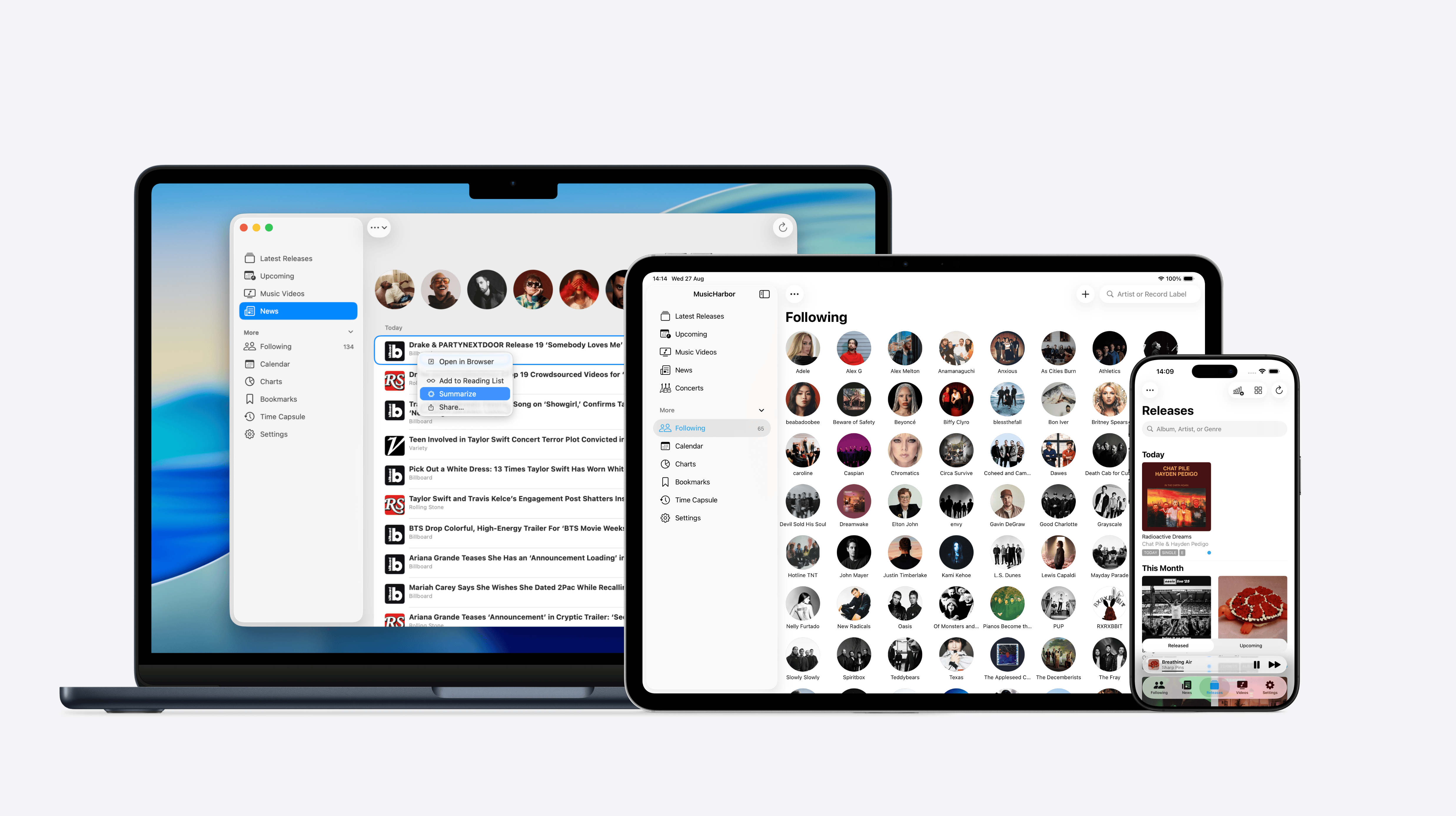
The new design language creates a deeper separation between content and navigation controls, smoother animations and transitions. MusicHarbor uses it across all platforms for a consistent experience, offering better-organized actions in toolbars, tab bars, and context menus, plus more playful, gesture-driven animations throughout the app.
A fairly common pattern I expect to see with the new APIs is moving the search function to the tab bar, centralizing it in a single place. I think this is a great idea, and I already have some thoughts on how MusicHarbor could benefit from this pattern. Unfortunately, I didn’t have time to implement this for day one of iOS 26, but it’s something I definitely plan to include in the future.
Updated App Icons
The update also brings support for every icon appearance: default, dark, tinted, and clear.
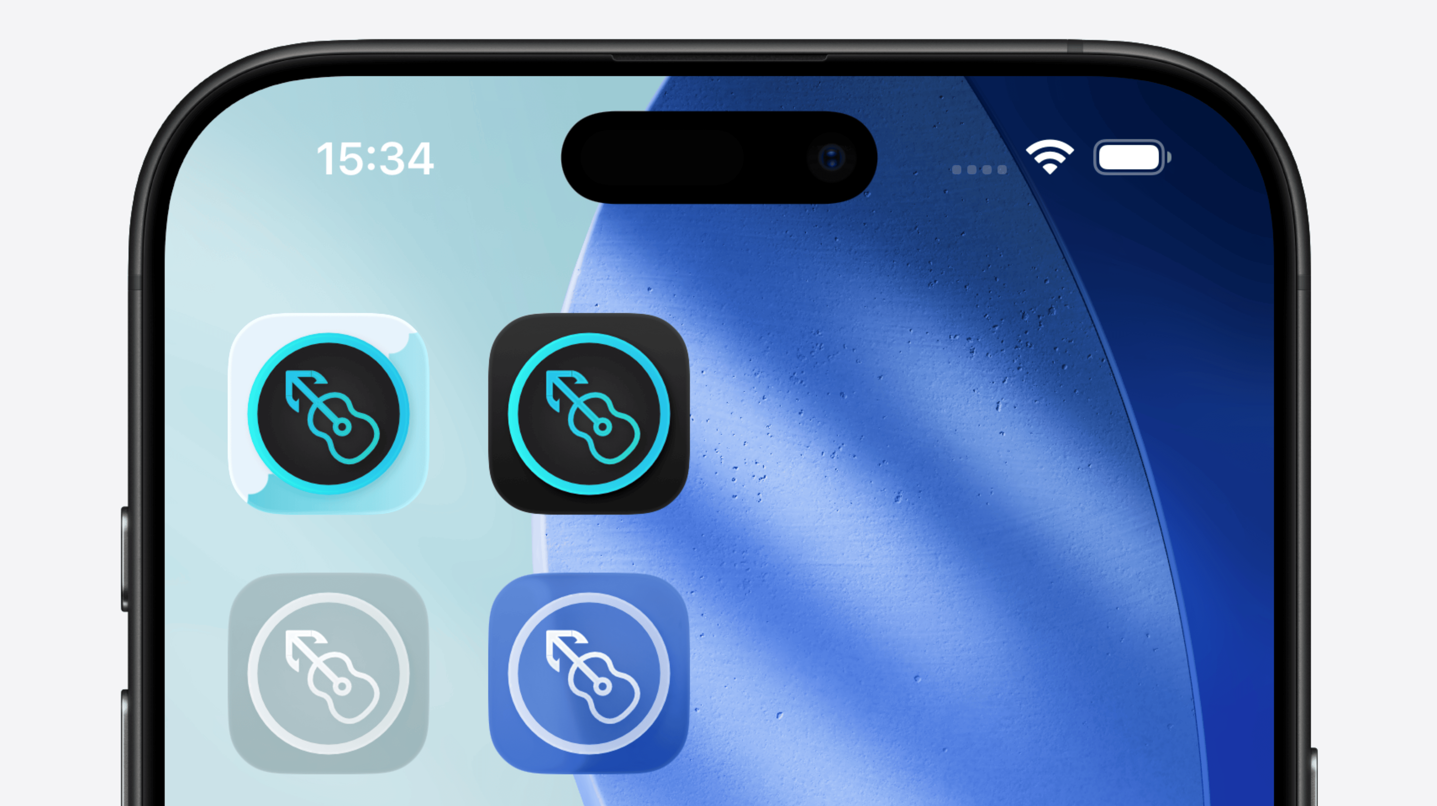
I’ve noticed other developers struggling to ship all of their alternative app icons in the new Liquid Glass format, so for now, I’ve decided to adapt only the default main icon. There’s also a fair point to be made that MusicHarbor no longer really needs most of its alternative app icons. After all, they’re mostly just color variations, and nowadays, the same effect can easily be achieved by adjusting the Home Screen tint color. This is something I’ll need to keep an eye on and decide how to proceed.
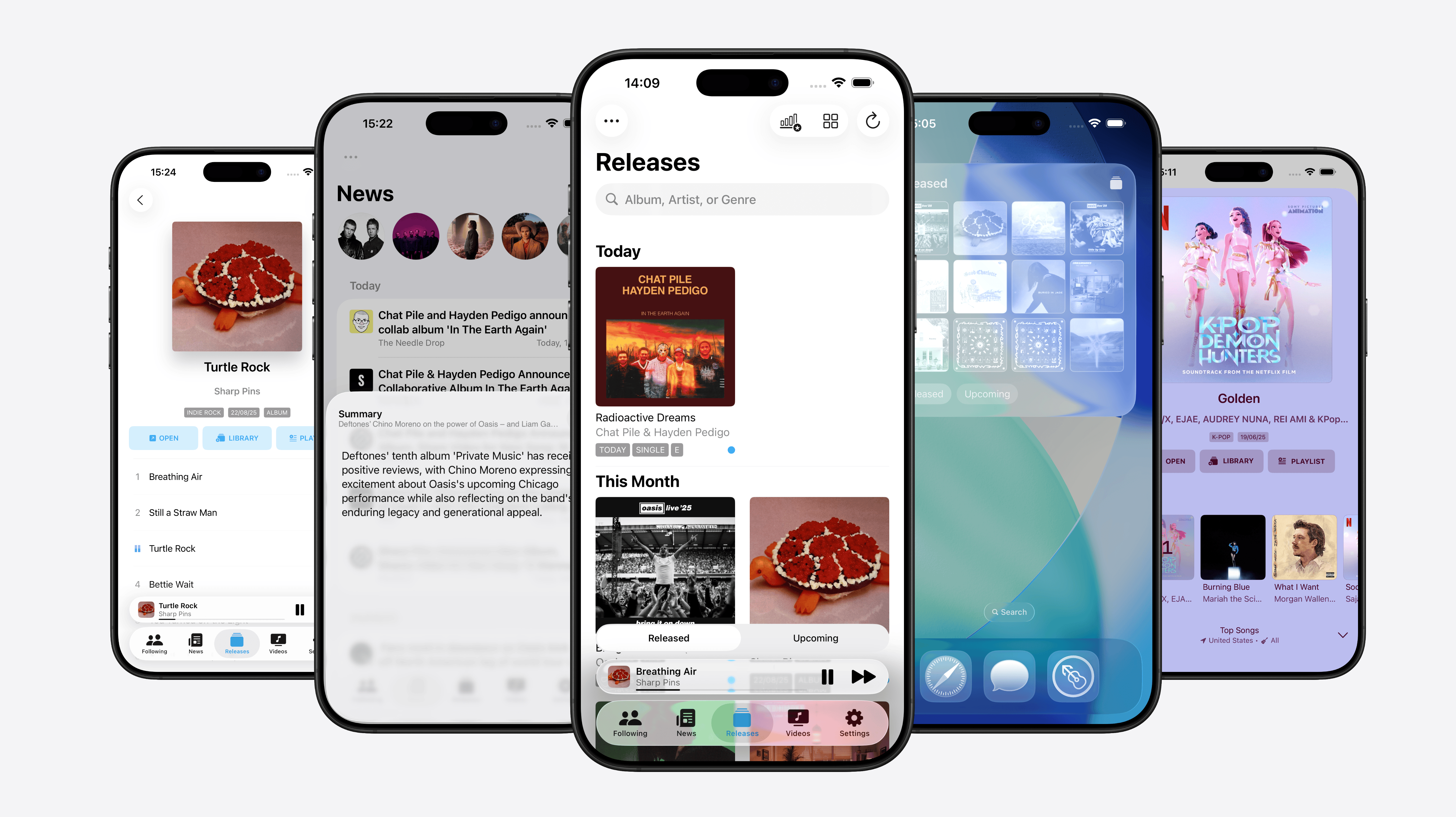
Miniplayer
Previewing new music is now better thanks to a floating mini-player that lets you keep track of what’s playing. And now with sequential playback, MusicHarbor lets you preview entire albums track by track.
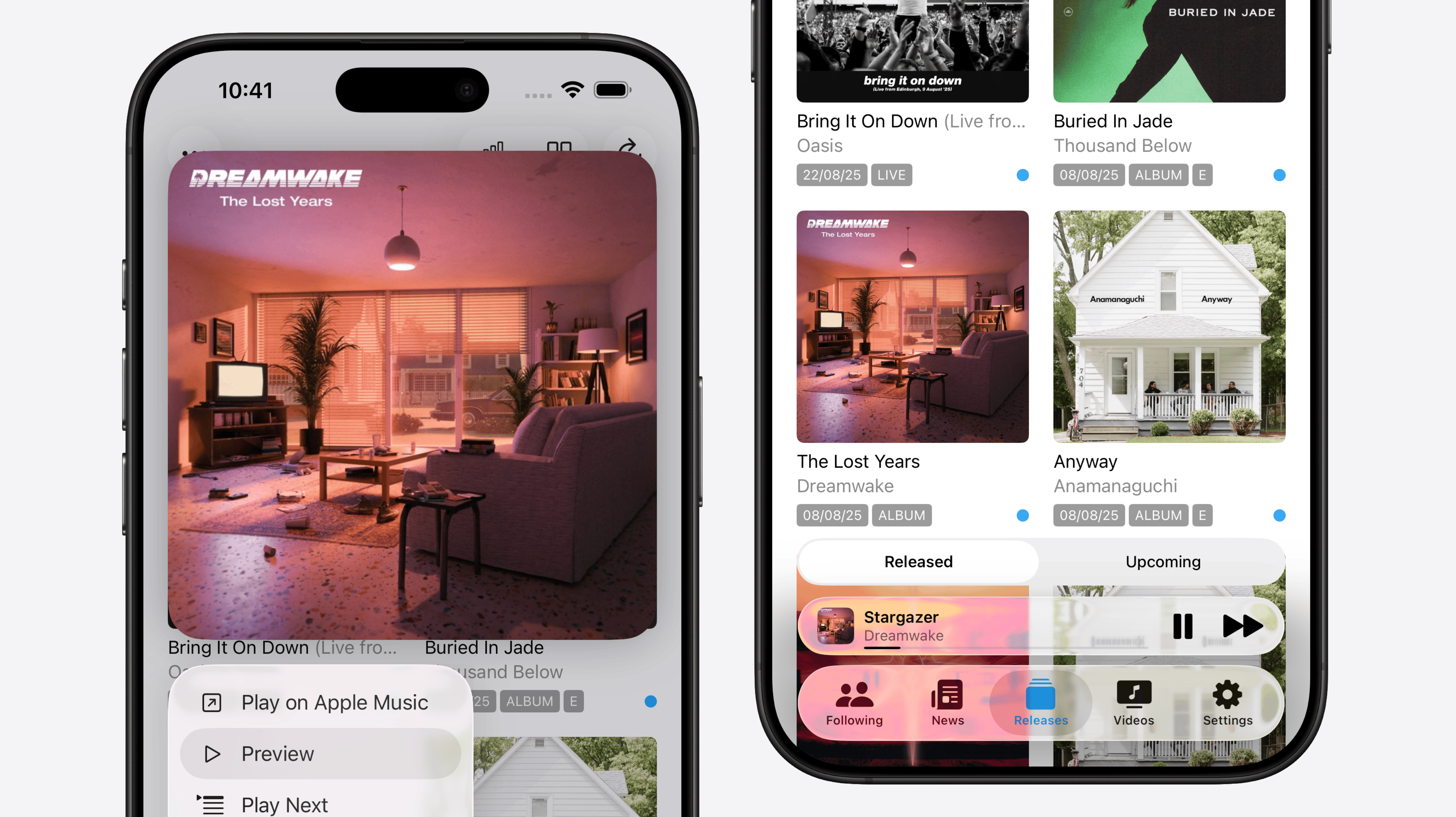
This is one of my favorite new features, made possible by the latest APIs, and I think it completely changes how I preview new music. Now, I can simply long-press an album, tap its Preview button, and listen to each song one by one in the miniplayer. It lets me manage new music without constantly navigating in and out of albums, creating a smooth workflow for discovering tracks I want to add to my library or save for later in MusicBox.
News Summaries
MusicHarbor brings you more than the latest music releases. It also provides stories and news from the artists you follow. And now, with Summaries powered by Apple Intelligence, you can quickly turn any headline into a concise, AI-generated summary.
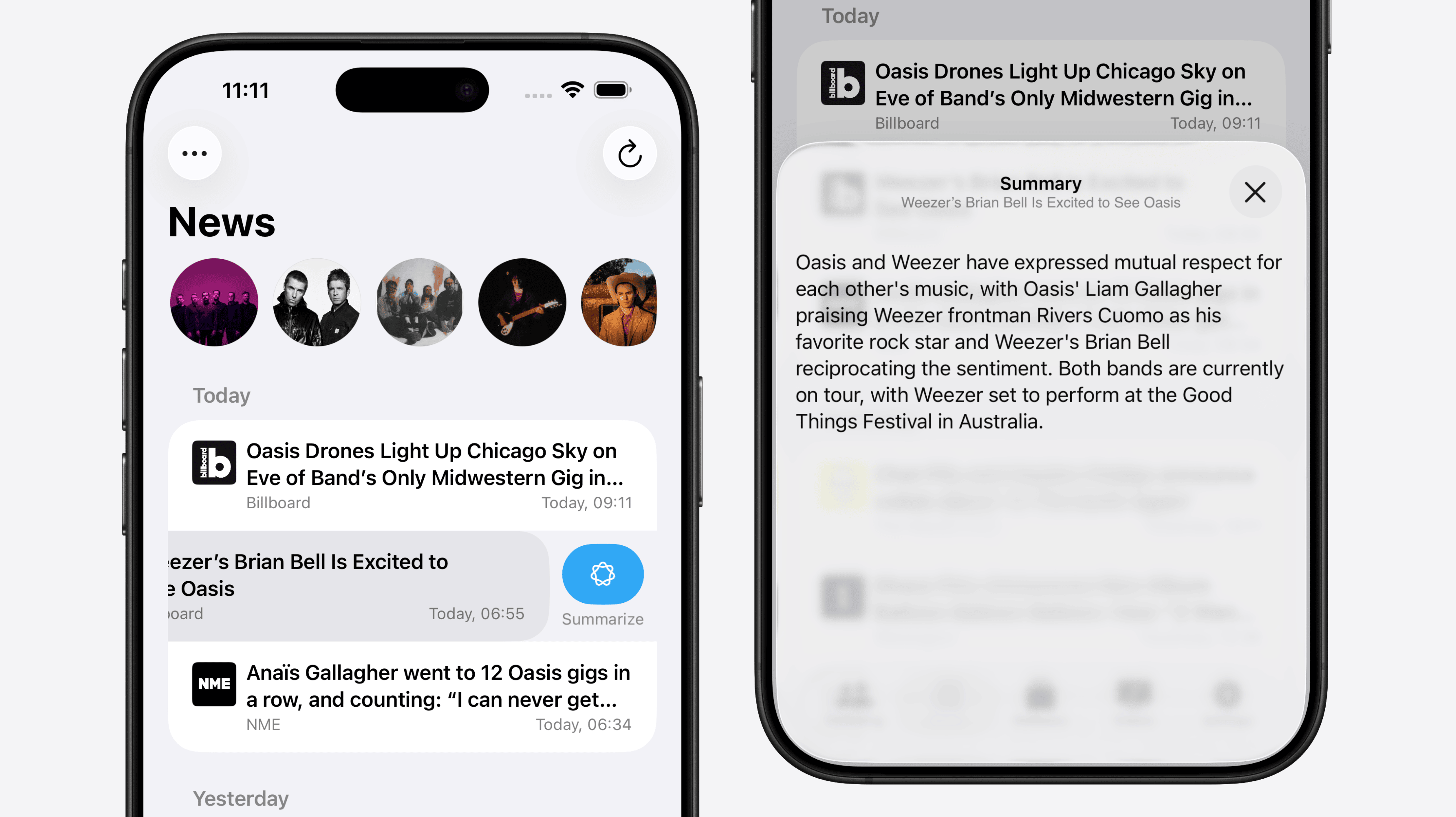
I think this feature is incredibly useful for triaging news on the go. I usually start by saving articles I want to read later to my reading list, but it’s not always easy to know if an article is worth diving into based only on the headline. Now, I can read a summary first to get a clearer sense of the content, and then decide whether I want to read the full article later.
With this update, MusicHarbor feels more modern, smarter, and easier to use. And this is just the beginning. I’m excited to explore a larger redesign with a unified search tab and new opportunities to make the app even smarter with Apple Intelligence!