What’s New in Play for iOS, iPadOS, and macOS 26
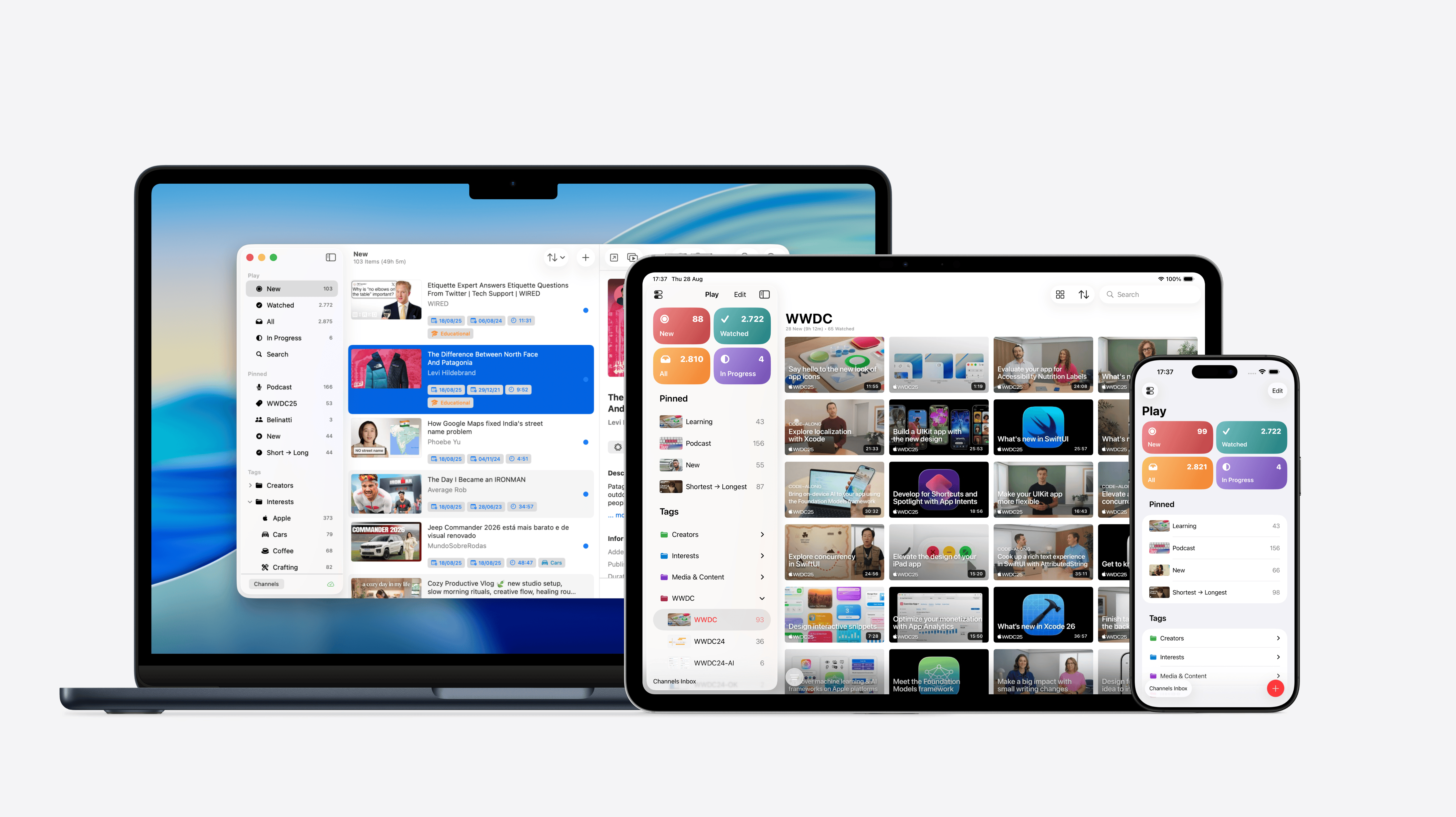
This is one of those updates that brings big changes both under the hood and in the parts you actually see and use. Behind the scenes, I’ve made changes to navigation components, which should make the app more robust and reliable. And on the surface, Play now features a modernized UI that adopts the new design language in every view and platform.
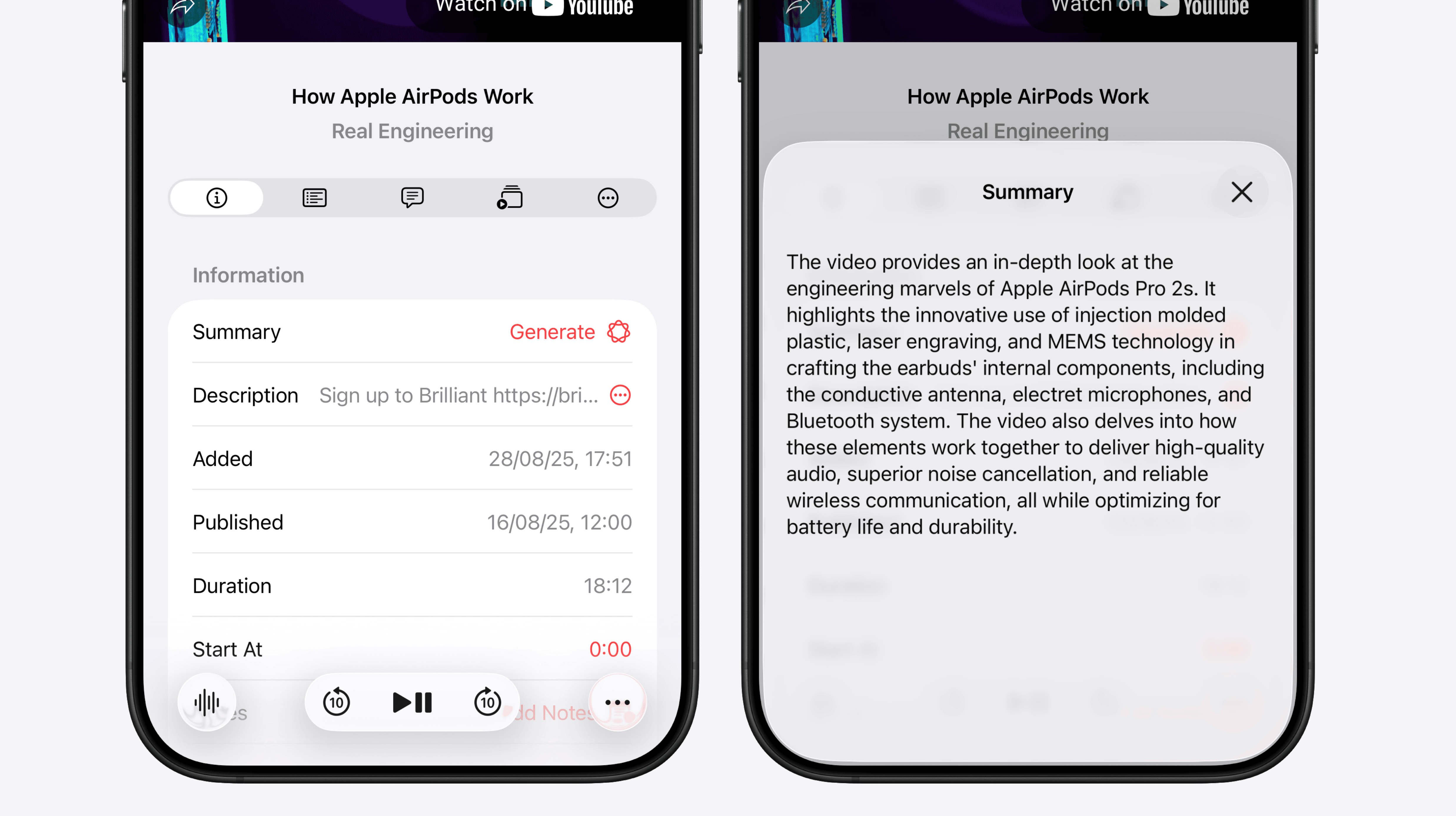
In addition to its refreshed look, this update also includes a few smart features powered by Apple Intelligence. These features lend a hand with everyday tasks, making them a little faster and easier to accomplish. And for the first time, Play can now summarize YouTube videos! This is a feature I’ve wanted to build for a long time but only now became possible thanks to the local AI models provided by Apple Intelligence.
Fresh Design
When I first started experimenting with the new design language, I struggled to find a way to bring it into Play so that it didn’t just look different than the previous version, but also functioned better. It took me a while to figure out how to apply Liquid Glass effectively, but after a few iterations, I’m happy with how it turned out.
I couldn’t resist rolling out a few pieces of the redesign early, so you may have already noticed some of them in the latest updates available on the App Store. Changes involving Liquid Glass and the new design language will obviously only ship alongside iOS 26.
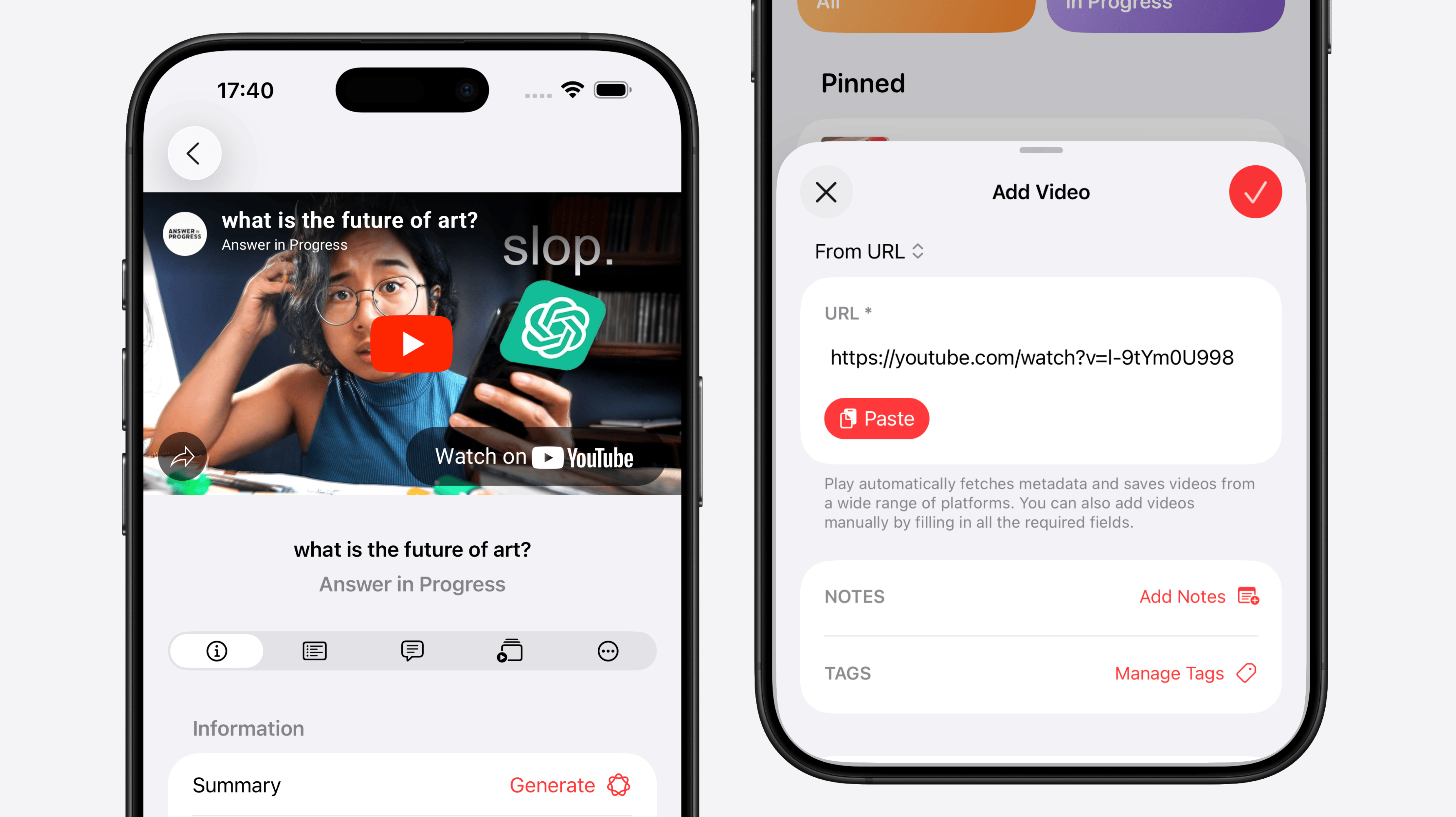
One of my favorite things about the new design language is how it creates a deeper separation between content and navigation by elevating toolbar and navigation bar buttons. I think they now look more like actual buttons compared to the old glyph-only design. The redesign also feels more playful, with buttons that animate and shift shape as you move between different views. In this update, I’m also taking advantage of newish navigation transitions, like the zoom effect that plays when opening a video’s detail view, or the smooth morphing animation when a modal sheet expands from its source button into a full-size sheet. A great example is the new unified Add Video sheet.
iOS 26 introduces the ability to add subtitles to views, so I took this opportunity to move the custom-built status bar from the bottom to the top. It feels much more natural up there, right next to the view’s title. In turn, the search bar has shifted from the top to the bottom, making it easier to reach and more in line with the rest of the system.
One thing I wanted to do but didn’t have time for (did I mention this update touched basically every view and the entire navigation structure of the app? 😆), was to switch to a tab bar design and centralize all search into a dedicated Search button right there. I think this makes much more sense than keeping search inside specific lists, and it should greatly improve the experience of finding both local and online content, like videos you added or channels you’d like to follow. My plan is to start working on this after the release of the iOS 26 update.
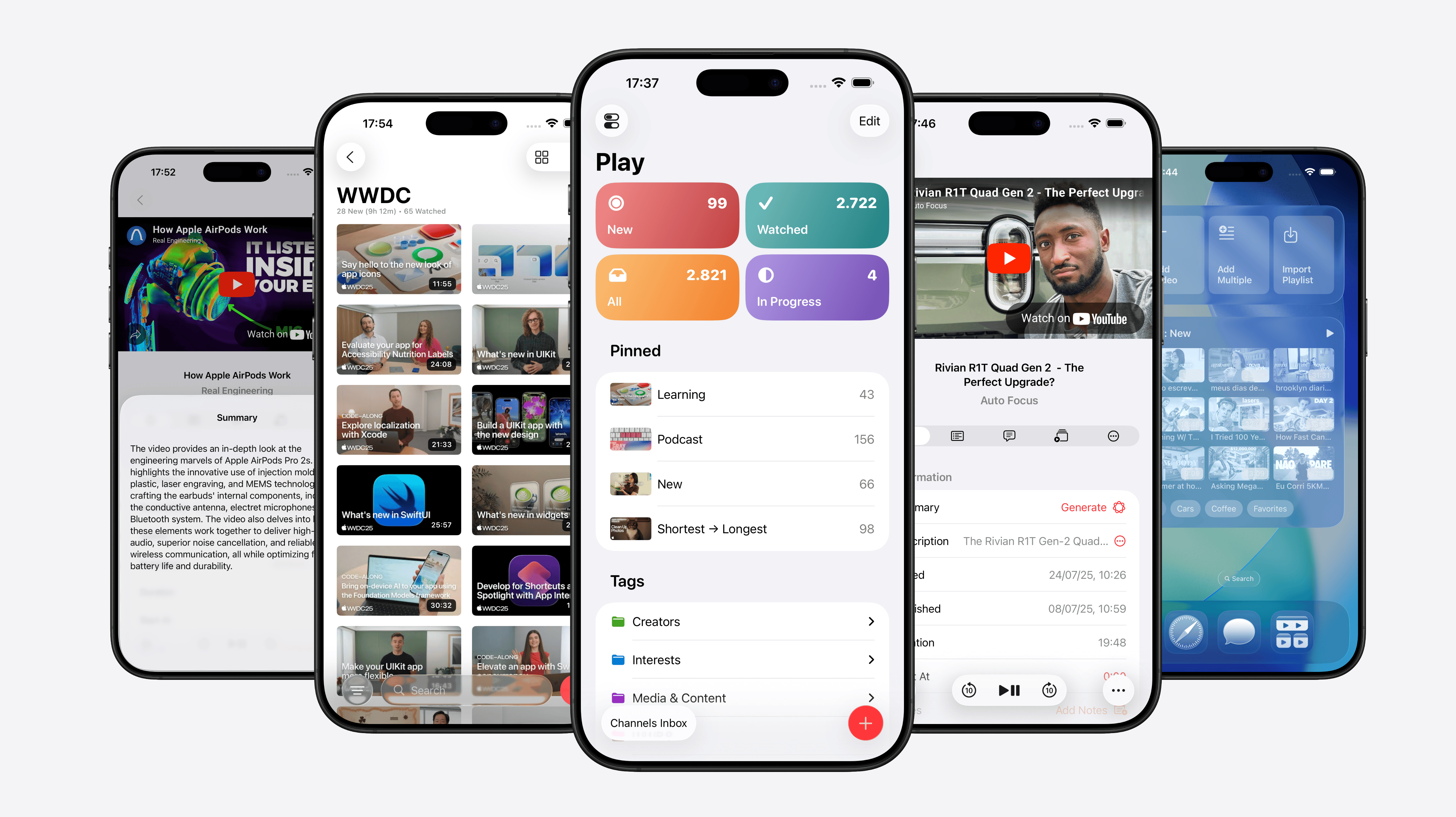
I’ve also redesigned modal sheets throughout the app so they only take up the space they actually need, making them less likely to get in the way of other content you’re viewing. For example, the video description now appears in a half-height sheet, so it doesn’t cover the video that might be playing at the top.
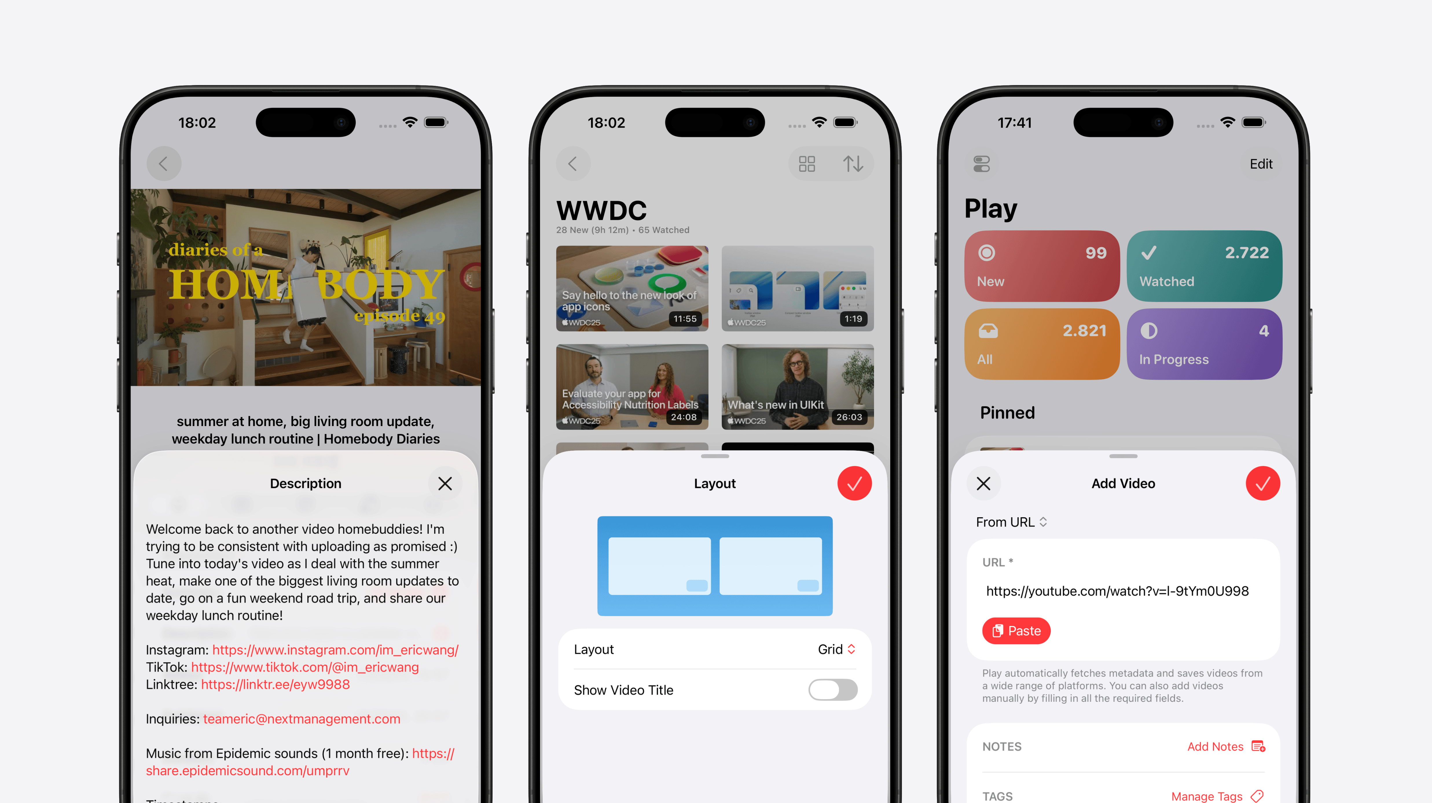
Another example is the Add Video sheet, which now shows only the most common controls at first, and lets you quickly paste a video URL from the clipboard. It also animates and morphs directly from the button itself, which I think looks super cool. I’ve also made some settings accessible directly from the view they affect—like customizing which sections are visible on the start view by tapping the Edit button, or changing the layout of the list of videos.
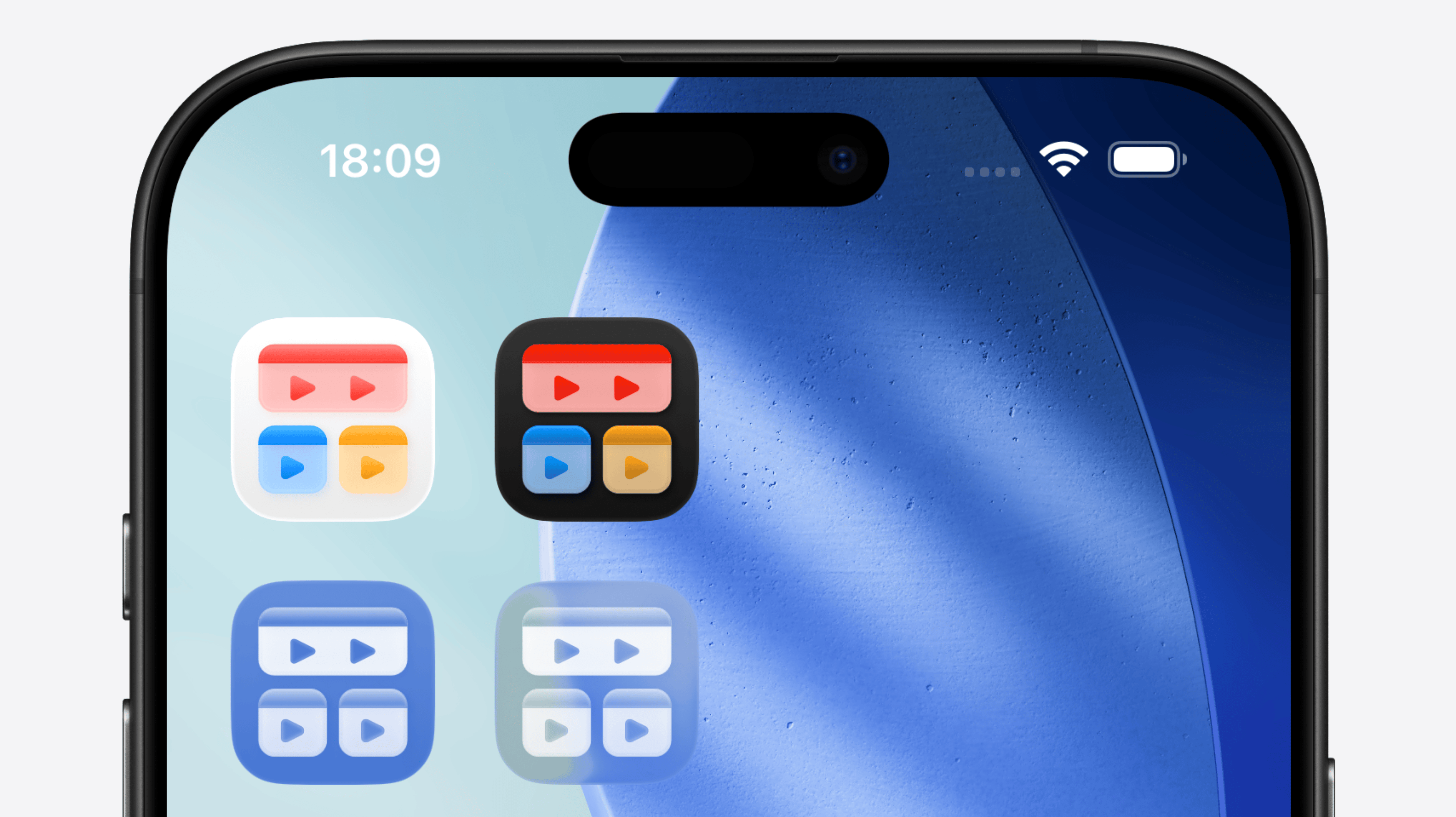
Updated App Icons
Of course, this update also adds support for all icon styles: default, dark, tinted, and clear. The redesigned icon now has much more depth than before, and I really like the way light catches on the corners of the play boxes.
Video Summaries
This is a feature users have been requesting ever since the rise of LLM tools, but it’s actually been hard to implement without local models due to cost. Videos come in all lengths, and processing arbitraty videos can consume many tokens and quickly get quite expensive. Luckily, with Apple Intelligence, tasks run locally on-device, which finally allowed me to implement this feature. I find it especially useful for deciding what to watch next or for quickly grasping the main idea of a long video.
Tag and Icon Suggestions
I think these are the areas where AI can lend a helping hand in completing our tasks without getting in the way. With tag suggestions, Play can proactively suggest three tags that suit your video, offering a mix of tags you already use and new ones you might want to create. This makes it easier for new users to start tagging their videos and gives existing users ideas for additional tags they may want to apply.
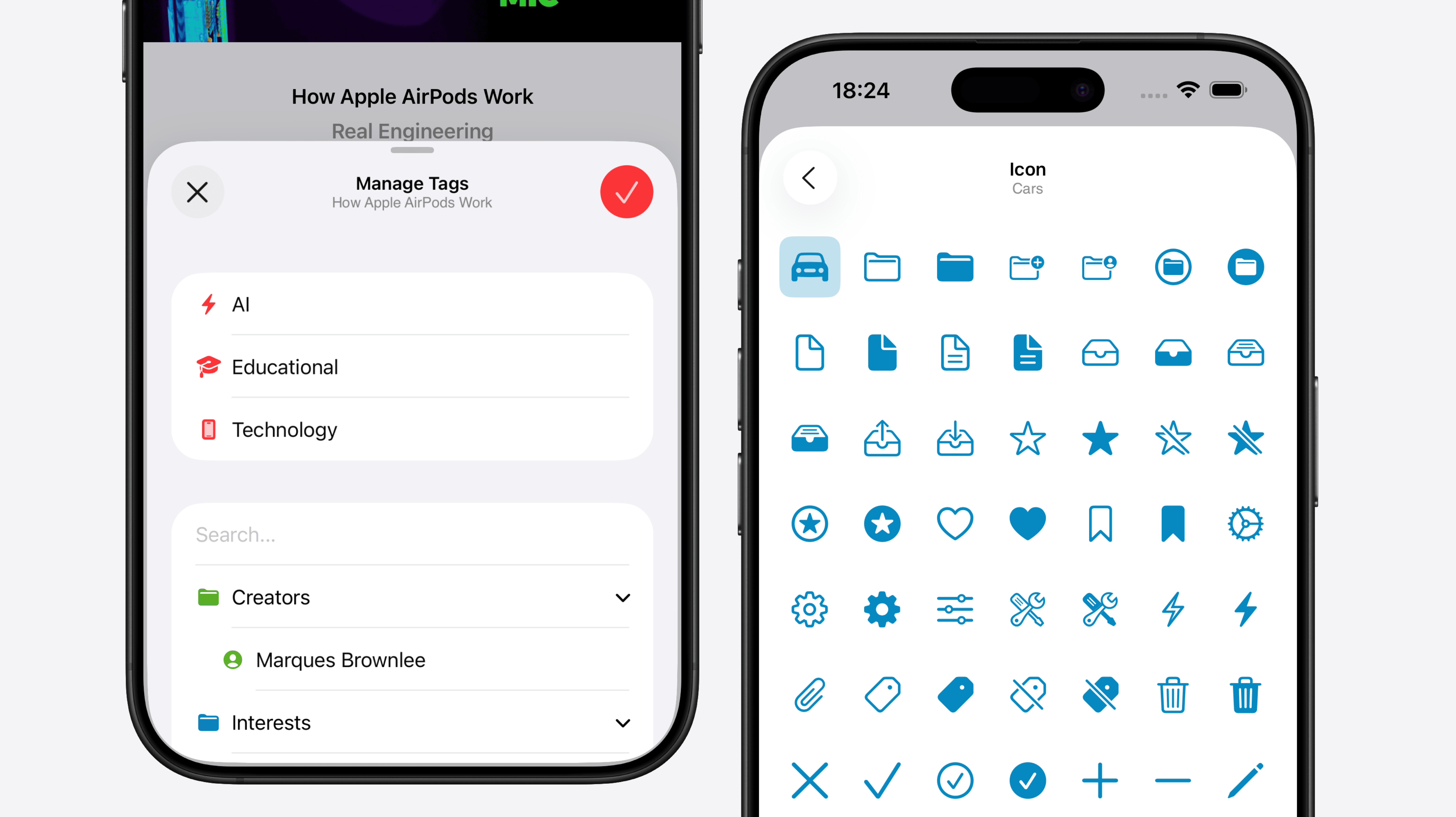
A similar situation happens with icon suggestions. In Play, we can configure custom icons for tags, smart searches, and folders, and now AI can suggest a fitting icon based on the item’s name. It’s a small touch, but it can save lots of time when we don’t need to manually hunt for the perfect icon.
I’m thrilled with how Play has embraced Liquid Glass, and I have plenty of ideas for future structural changes that will further enhance the user experience and usability. Another exciting area is Apple’s Intelligence features. They’re still in the early stages, but I’m eager to integrate them more deeply throughout the app, helping with small tasks and unlocking new capabilities that weren’t possible before.